Each poster in Project Two must be able to exist on its own, completely independent of the others in the series. The viewer must be able to both
understand (information) and
appreciate (design) each poster as an individual piece of visual content. The first poster will be simpler, the second slightly more complex, the third the most complex. Your challenge is to ensure that at each interval of this process the poster looks like a complete, well-composed piece of graphic design. If there are holes in your designs, we must either fill them, rearrange them, or eliminate them altogether so that it is not apparent that something is "missing."
Poster 1: Small Amount of Info, Large Negative Space 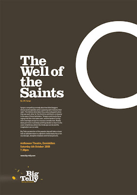 Simple shapes — like this circle — can be quite elegant when given space to breathe. Also, the straight crop of the "O" paired with the straight flush-left alignment of the type create a complementary relationship to the curve of the large shape. This creates a well-controlled negative space.
 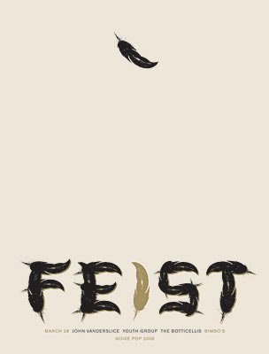 You may want to preserve a large amount of open space in the center of Poster 1 by keeping content tied to the top and bottom. Fine — just be sure the open space still feels comfortable on the page, not like a huge, gaping hole. This single, falling feather makes the negative space feel like air, gives it a purpose, makes us OK with having so much of the poster devoted to it.
 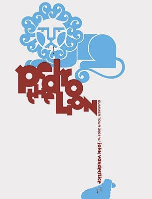 Again, preserving a large open space is perfectly acceptable when the page is well composed. The trickle of text from top to bottom balances the weight on the page and creates interest for the reader to turn their head and read the small type.
 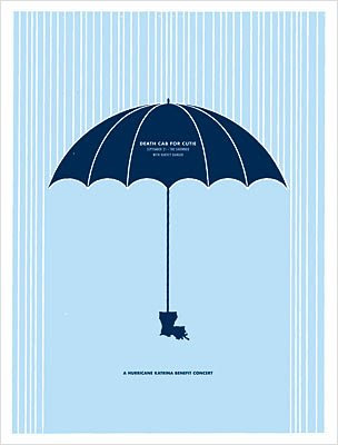 You may feel like your first poster is too blank and needs a "background." Playing with foreground and background can and should be subtle — like this "rain" which is really just many thin lines, cut off by shapes in the foreground.
 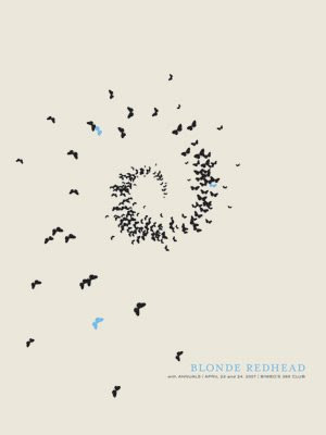 A broad curve can be a lovely beginning for a composition — it gives the page direction and movement and gives the viewer visual instructions as to where to look next. This swirling flock draws our eye to the center but quickly back down and around to the bottom right.
 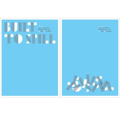 A well-composed "emptiness" can be successful with the use of bright color and thoughtful spacing.
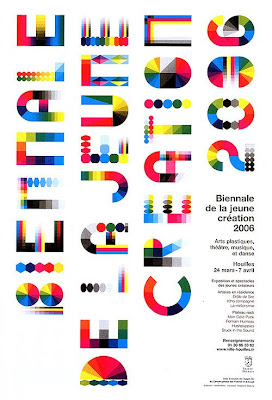
 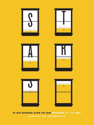 While windows are too literal for our purposes, this is a great example of highly regimented spacing — two large, vertical columns with a small centered block below. What makes it interesting is the disappearing nature of the large letters and the side-to-side rhythm is produces for the viewer.
 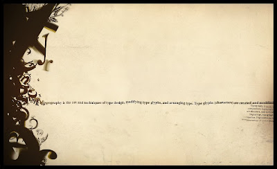 High density contrast is yet another way to create interest on an otherwise blank page. A single line of type meanders across the page, unsupported and we want to read it because it is fragile and completely different from the dense jumble it emerges from on the left.
 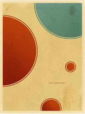 Again, simple shapes can be lovely and interesting when given space and scale to play with. In this example, the circles are outlined to create just a hint of additional interest, making them less flat on the page. Also, the scale contrast between shape and type is so extreme that it doesn't matter that the words are so tiny — we are drawn to read them simply because they are drastically different from everything else on the page. Poster 2: More Content, Layering Begins, Controlled Negative Space
 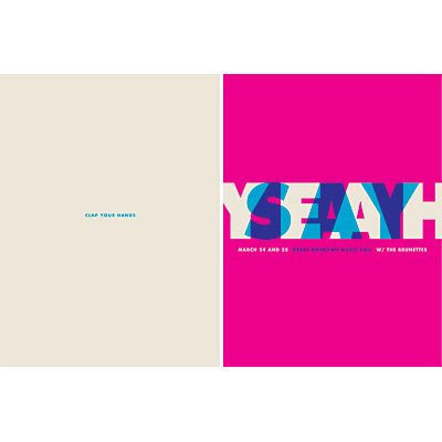 The move from Poster 1 to Poster 2 does not have to feel like being beaten with a baseball bat. It can be completely subtle — a simple sift from left to right and a change of color.
 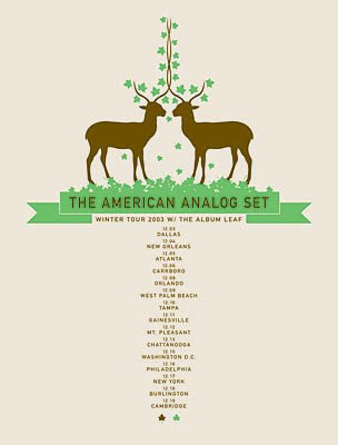 This project might be about overprinting but it doesn't have to be all about overlapping. The second poster could be a simple accumulation of content that resides around the previous content. Imagine that the slender centered type and deer where printed first on this poster, then the green grass and leaves were added later. You could recreate this effect with type rather than illustration and develop a cumulative design that grows out from the center.
  This is another way of imagining a cumulative design that does not focus on shear overlapping. I could see this poster ending up completely filled, edge to edge to edge, but this intermediate step still feels well-composed and complete.
 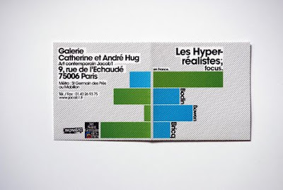 Many of you are dealing with bars of color but keep in mind that these bars — like the circles — need to be thoughtfully placed to create a balanced composition.
 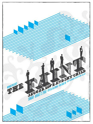 Again, thoughtful arrangement of bars and lines — this time on the diagonal — creates interest, hierarchy, and well-controlled negative space.
 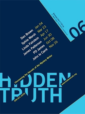 The second poster is your first glimpse of layering. Rather than blacking out entire words or phrases from Poster 1, consider cropping them in interesting ways to add intrigue.
 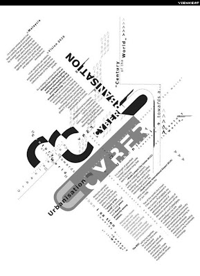 Poster 2 could also be very vibrant, with content replicated over and over, moving much faster towards the complexity of Poster 3. Although this example has many, many more pieces of information on it, it still preserves a great deal of negative space so that the design remains focused in the optical center and balanced on the page. Poster 3 (and 4): All Content, Highly Layered, Well-Composed Positive and Negative Space
 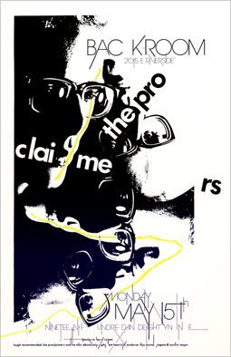 The final poster in your series will have at least a hint of chaos — it is expected when a single piece of paper is printed 3 or 4 separate times. However, do not allow the chaos to take over. You are the designer and you are in control of the space. This example shows how black and dense an area can be while still maintaining a stark contrast with empty, white space. This contrast keeps many elements of the poster highly legible.
 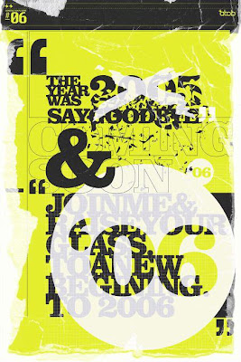 Not all design must be clean and tailored. Roughening the elements and combining solid type with outlined type can create a beautiful density that is tactile and visually stimulating.
 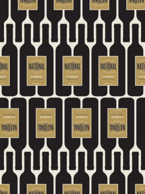 Some of you are working with overall patterning — this is an example of a finished wallpaper-like pattern poster. You might accomplish this effect with blocks of type or patches of color or plaid-like lines but the end result can still be completely regimented and controlled. Imagine that this poster began with only one set of wine bottles anywhere on the page and the pattern was slowly filled in throughout the process.
 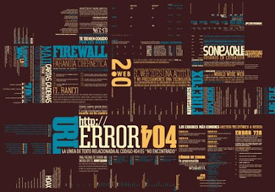 Same goes for this example. Imagine that this poster began with a single block of text and the rest of this delicious visual density emerged throughout the process to create the patchwork effect that you see here.
 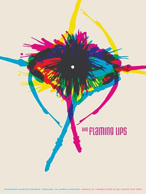 Conversely, your final poster could also remain fairly sparse, the density of information highly concentrated in one focused area with large amounts of white space still untouched.
 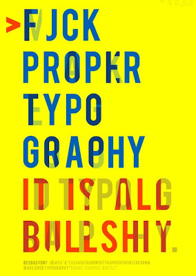 The final poster could be simple and minimal but, instead of concentrating in one small space, could cover the entire page in a very regular, calm way.
 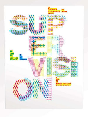 These last examples are all about color and texture — using simple colors and overlapping elements to create a rich density of ink on the page. Imagine all of these colors were printed one at a time, slowly building up to the finished product you see here.
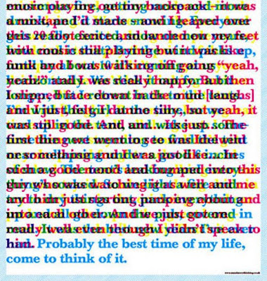

 A Few "Graphic" Notes:
 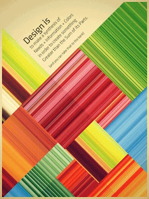 For those planning to use solid "blocks" of color, please keep in mind that a block of color need not be solid at all to cover an area of the page. Adding texture and breaking up solid spaces is how rich densities are developed.
 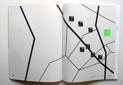 For those planning to use lines, please keep in mind that a line is simply the distance between two points. However, there can be many, many, many points along each line.
  For those planning to use areas of small type to create larger shapes and textures, please keep in mind that even within these collages, composition and density is a delicate balance. Just look at the care that was taken to create the flat of the "G" where the "Garamond" baseline rests. Proceed with caution and always keep an eye on the larger composition of your page.


